Spin.io
The challenge
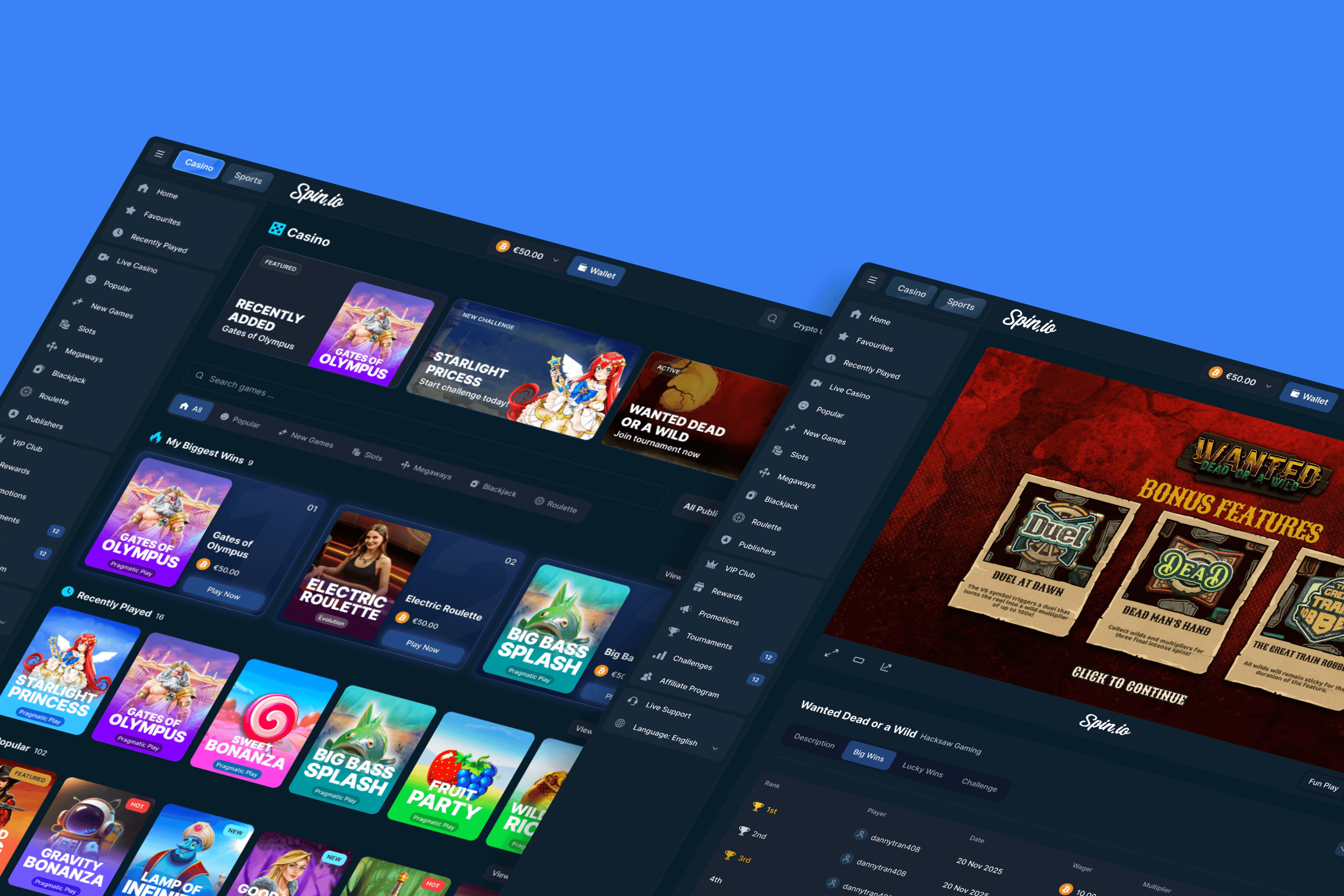
Spin.io is a crypto-casino. Trust is the actual product. Players are wagering real money in a category where most platforms don't last. The interface had to feel premium to a sceptical audience while absorbing wallet, token, and regional complexity underneath.
It was running on a white-label base: generic UI, inconsistent branding, no design system.
What was delivered
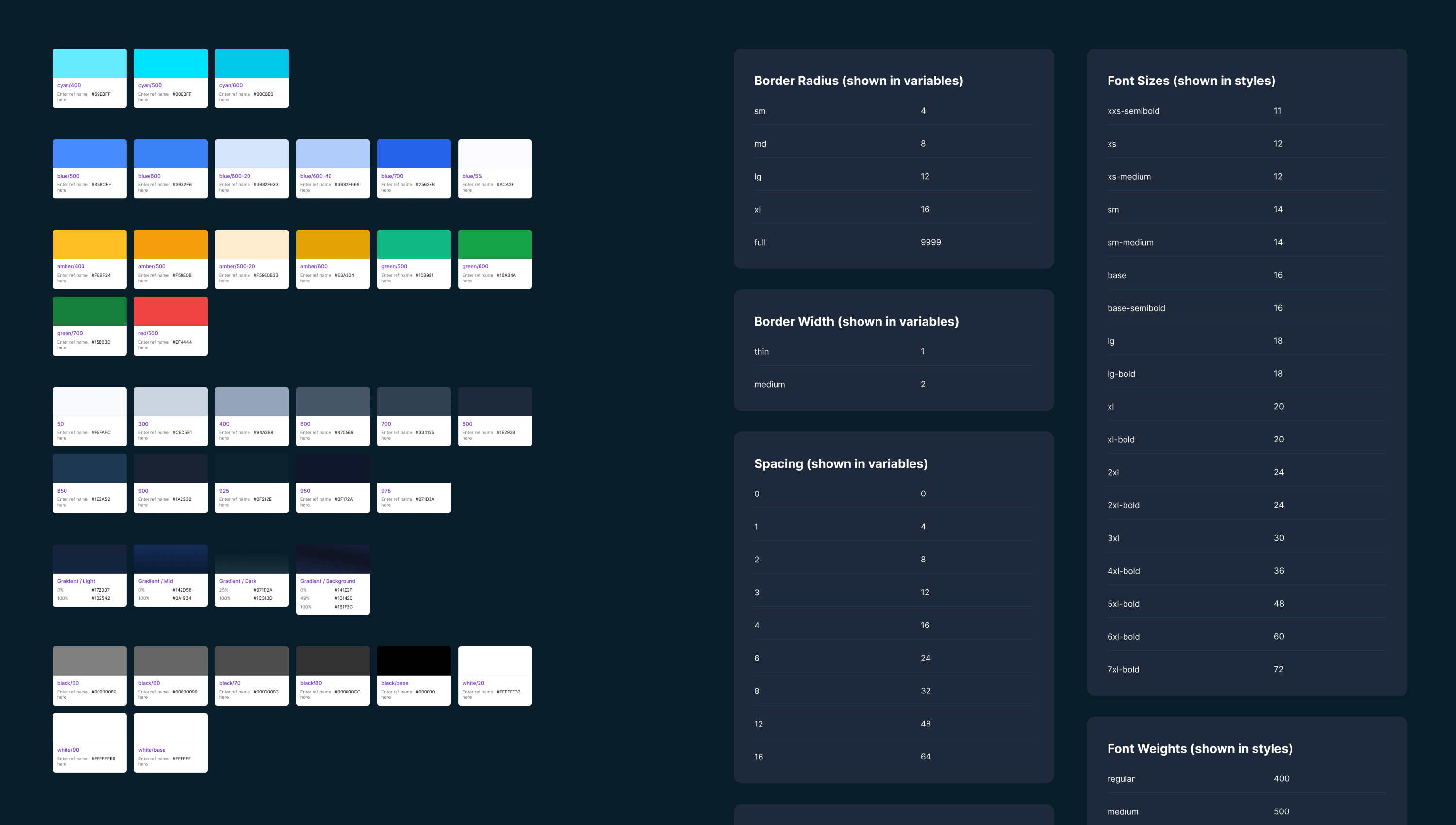
A production-ready design foundation. Codified, reusable, and built to scale.
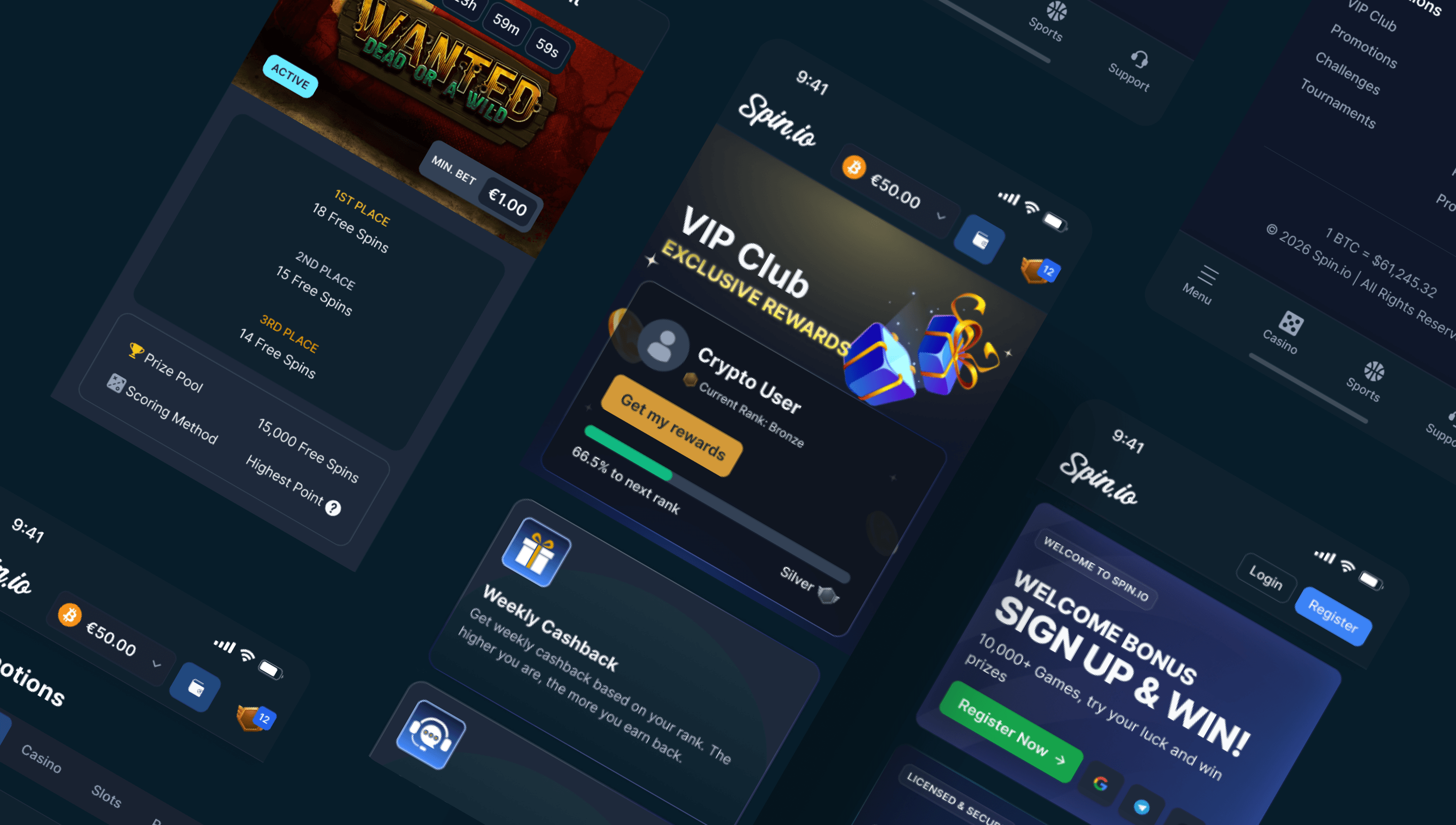
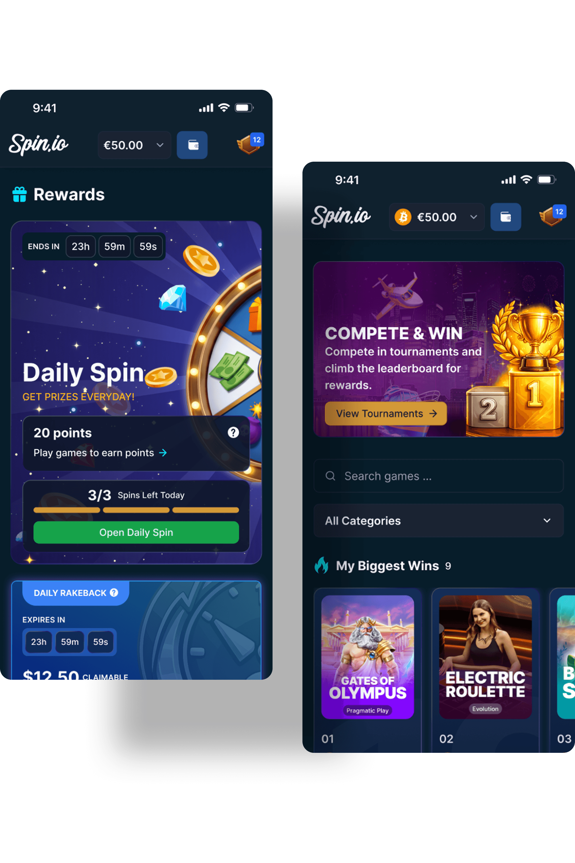
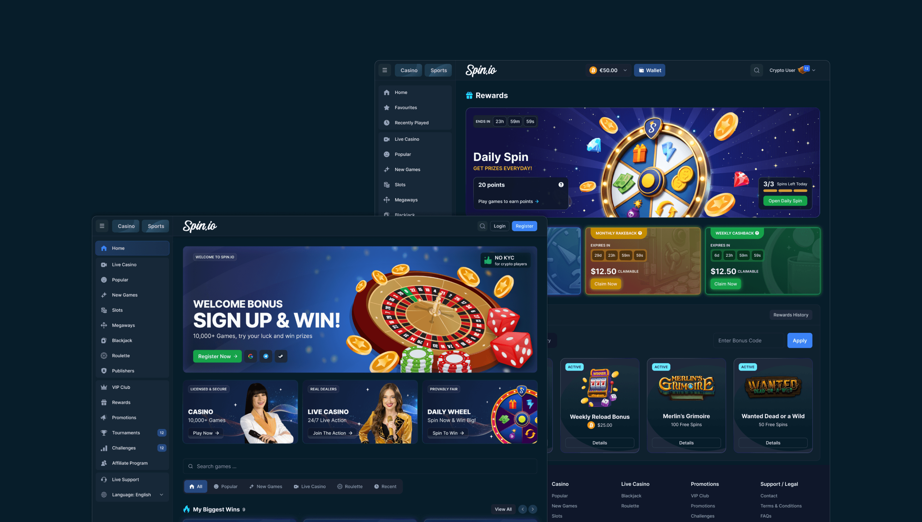
Rewards system
Three card types, three states each. Active cards lift forward in colour, copy, and glow; locked cards fall back into mono. Redundant by design, so no signal gets missed.
VIP programme
Six hexagonal tiers that escalate in visual weight from base to top. Page structure follows the user's question order: why VIP, then proof, then tiers, then action.
Sports betting integration
Third-party sports betting product redesigned to live inside Spin.io's brand. Typography, colour, and components all aligned. Reads as one product, not two.
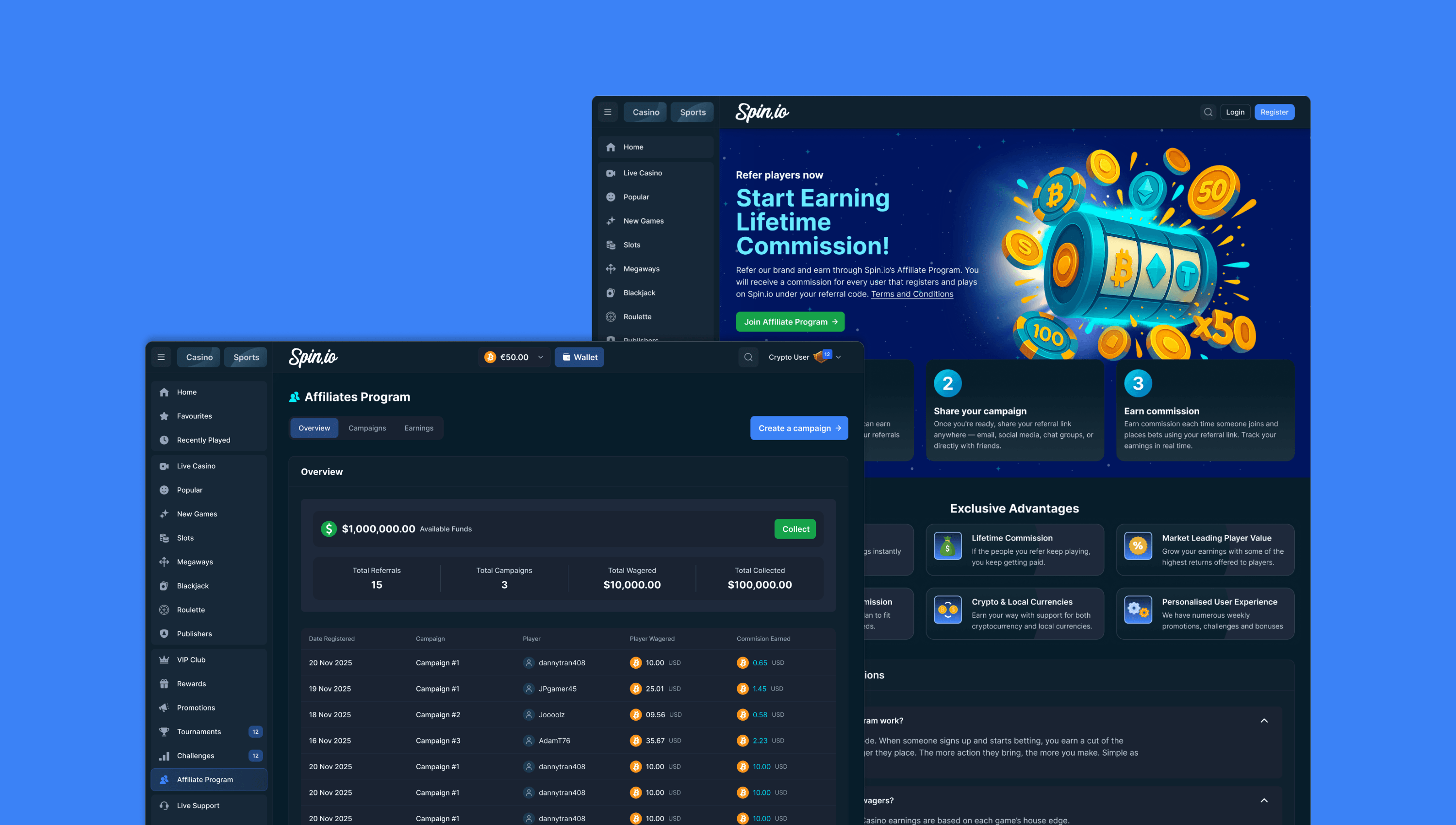
Affiliate page
The affiliate page is positioned to sell, not just to inform. Built around commercial mechanics, not visual treatment. Imagery carries the atmosphere. The card carries the offer.
Approach
Every decision was made with delivery in mind. Conservative UX for launch, explicit UI states, progressive disclosure over dense interfaces, and wallet-agnostic language throughout.
The design system was built so updates propagate automatically. Change once, every instance inherits.

Conservative by design
Explicit components, no speculative work, no design that wouldn't ship. The system shipped because it wasn't trying to do everything.
Designed and launched
The brand carries through every surface, and the team builds from the system rather than working around it.
The platform is in production. The system is doing what it was built to do.