A crypto-casino, built from the ground up.
Client
BetHype
Year
2024
Type
Brand + platform UI
Role
Brand & Product Designer
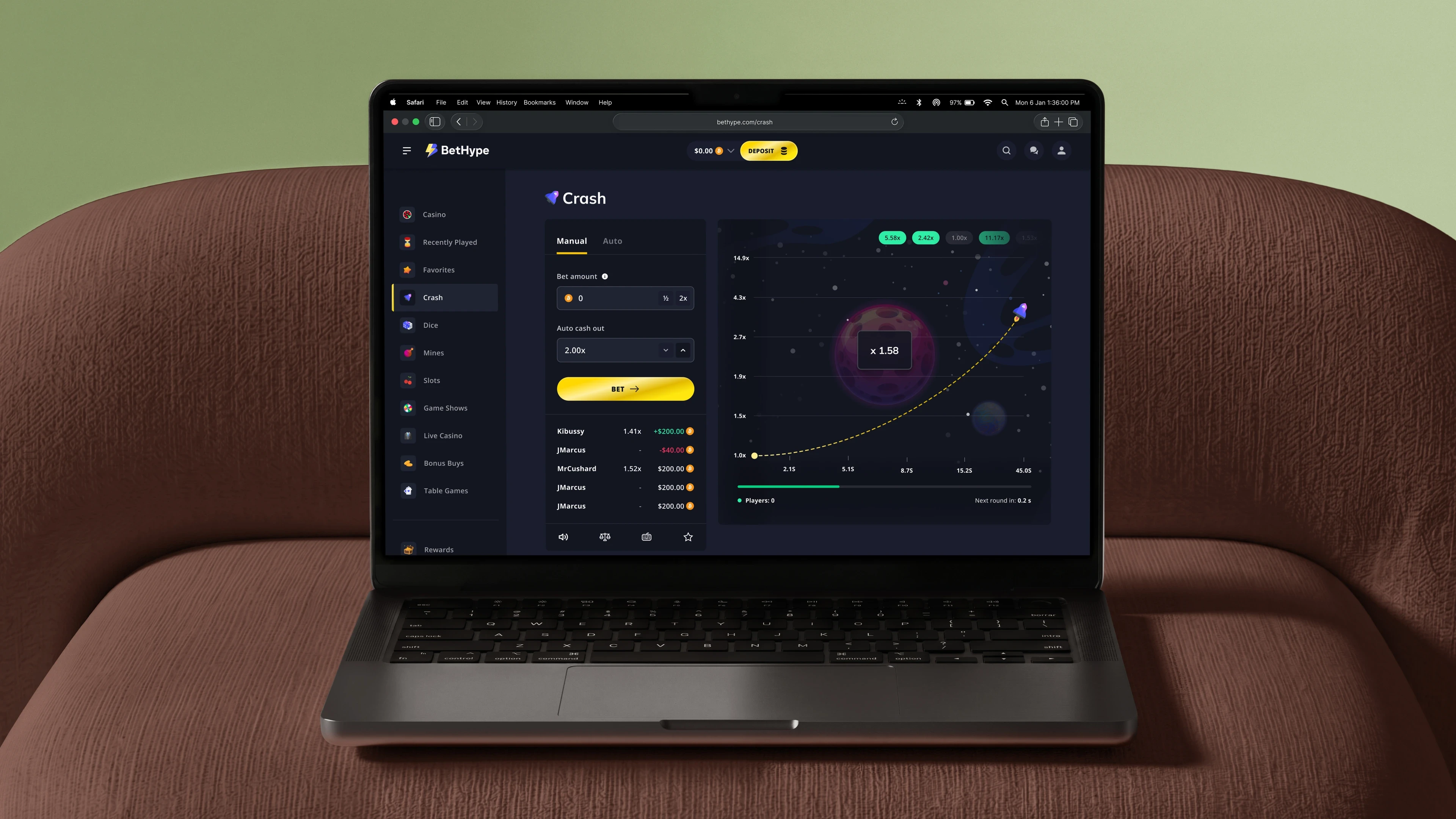
01 — Starting condition
A logo, and a platform still to be made.
BetHype arrived as an early logo and a rough set of layouts from a first attempt, with the visual design and the platform itself still to be made. The work began there and covered the rest: an identity built out from the mark, an interface designed across every surface, and a component system underneath it, built into a product that could ship.

Brand · the mark developed into colour, type, and a full system
02 — Approach
The brand had to come first.
Three decisions shaped the work. The first was to settle the brand before the product: the inherited logo was developed into a full identity, with colour explored and applied and a type scale set, so the platform had something coherent to be built from rather than assembled around.
The second was to build the platform as one component system across every surface, from the casino home to individual games and tables, responsive from the first screen rather than adapted to smaller ones later.
The third was to design for handoff first, with tokens, components, and explicit states mapped cleanly to code and worked through directly with the build team so implementation stayed aligned with intent.
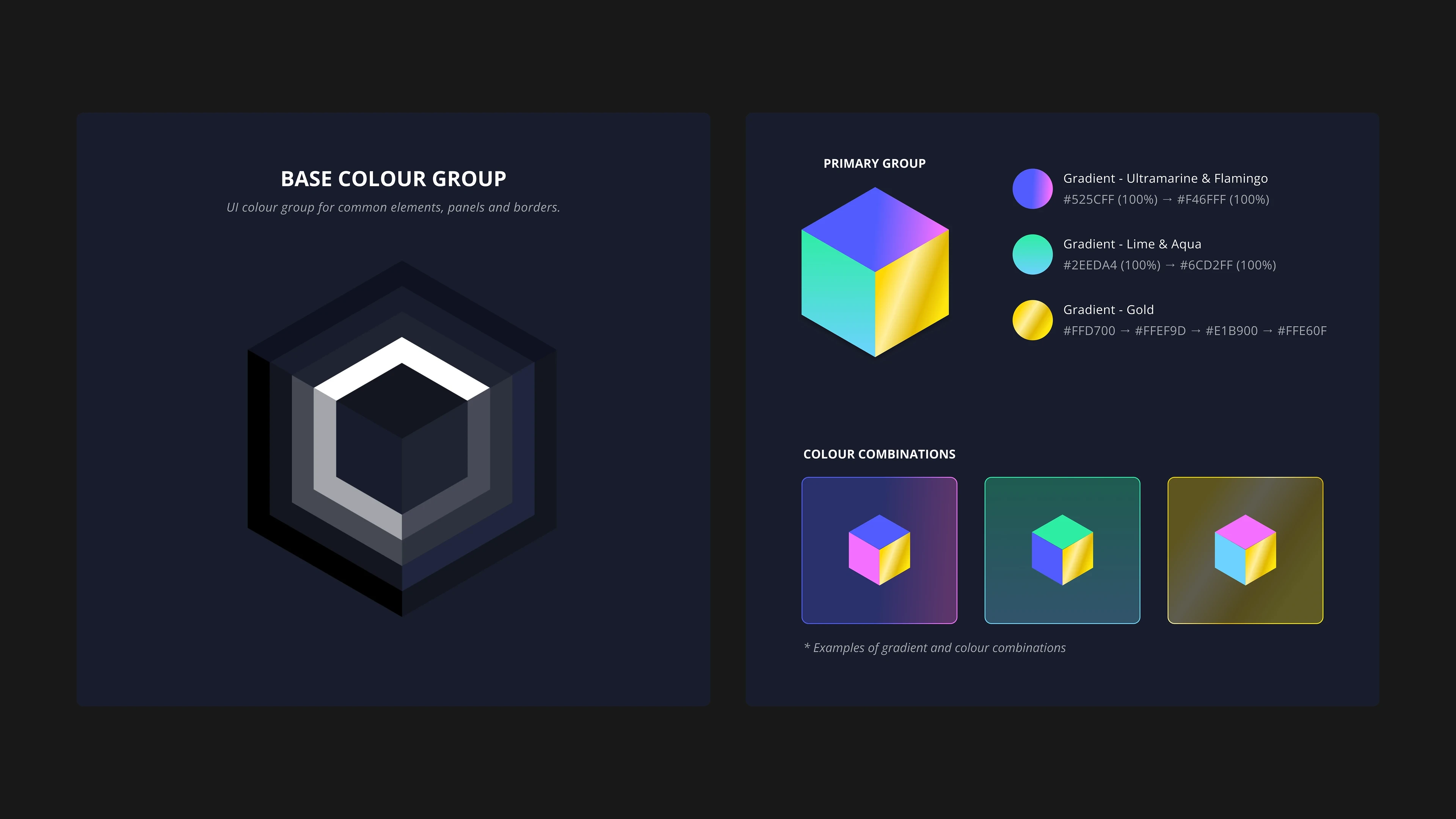
Colour · base and gradient groups, and how they combine
03 — What was delivered
The whole product, not just the skin.
A brand developed from an inherited logo and a full platform designed as one system, handed over dev-ready.
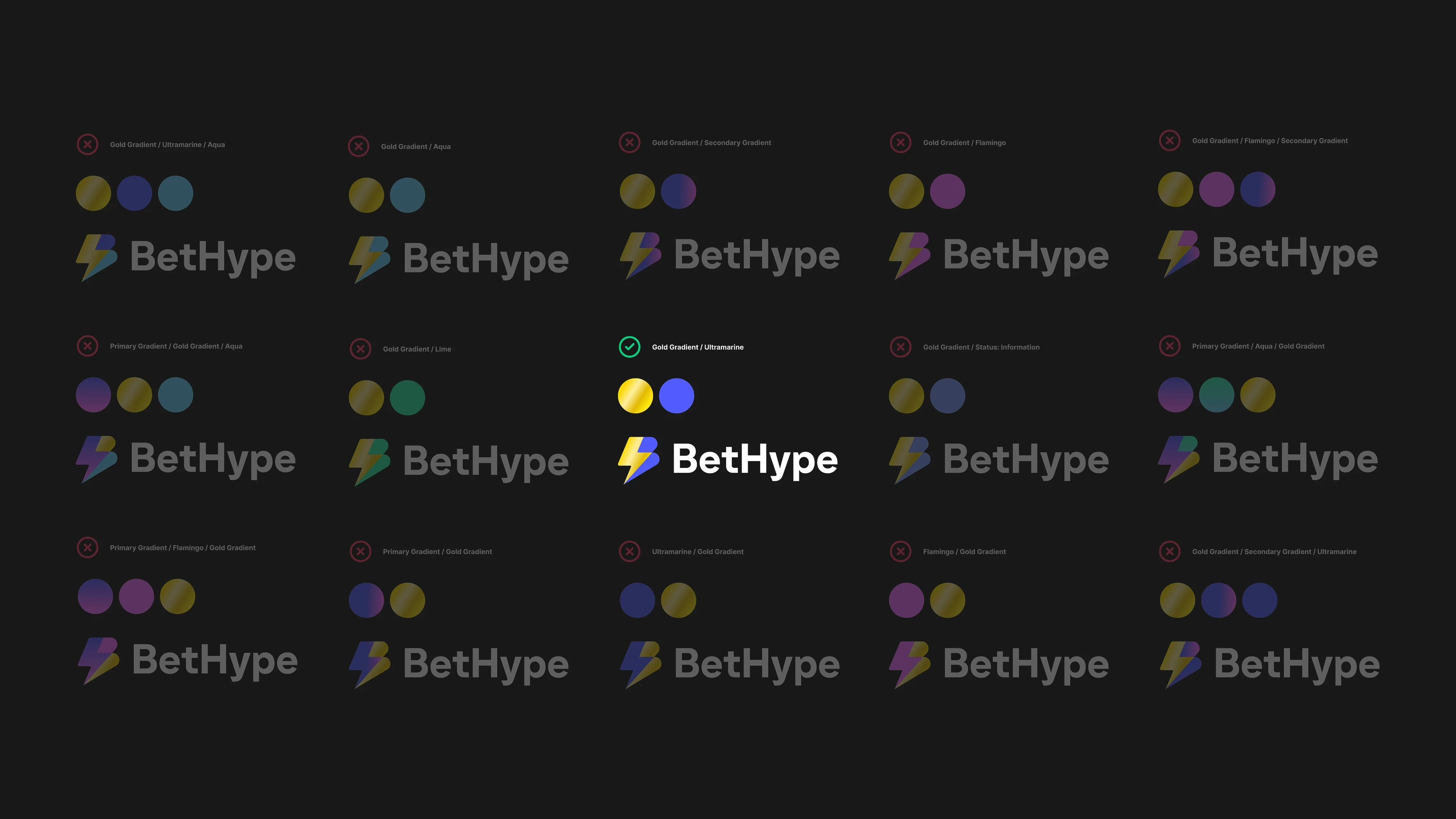
Colour way discovery
Brand development
A supplied mark, refined and built into a working brand: a colour system with rules for how it applies, a type pair and scale, and an asset library carried through every screen. The mark came in. The system around it did not exist yet.
The platform, built as one system
Every surface was designed from the ground up on one component set, from the casino home to live games like Crash and Dice, the slots and live-casino views, and the bet tables. States were drawn explicitly rather than left for the build to infer, so the product reads as one thing at every breakpoint, not a set of pages that share a logo.
A dev-ready system
Tokens, components, and states were organised for handoff and exported dev-ready, then worked through directly with the build team during implementation. The system was built to be handed over rather than reverse-engineered.
Visual direction
Hero banners, illustrations, and on-platform creative were built around the identity, giving the promotional layer the same voice as the product it sits inside.

Casino home · rails to game, one component set

Promotions Pages

Affiliate · referral surface
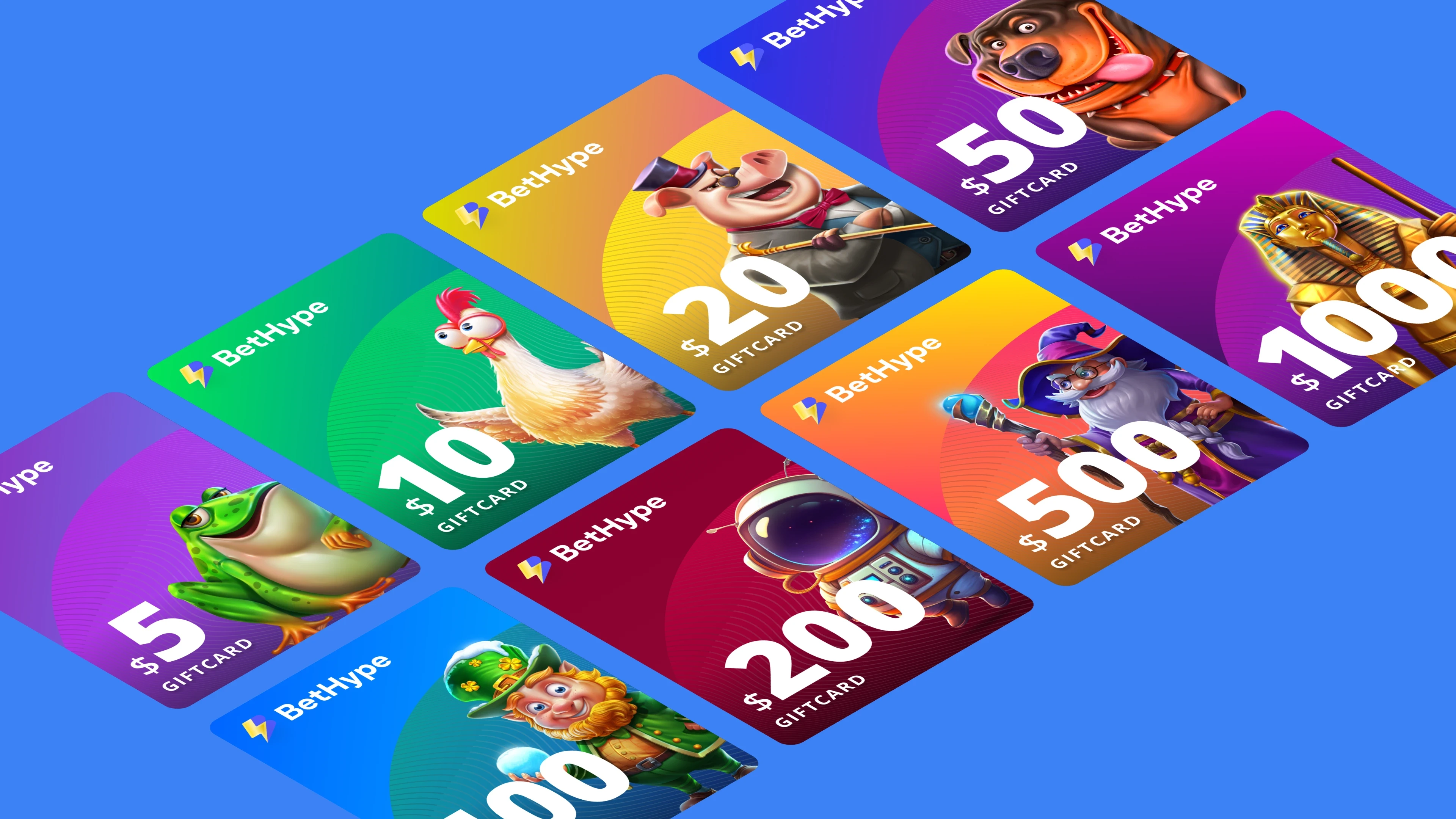
gift cards & promo assets

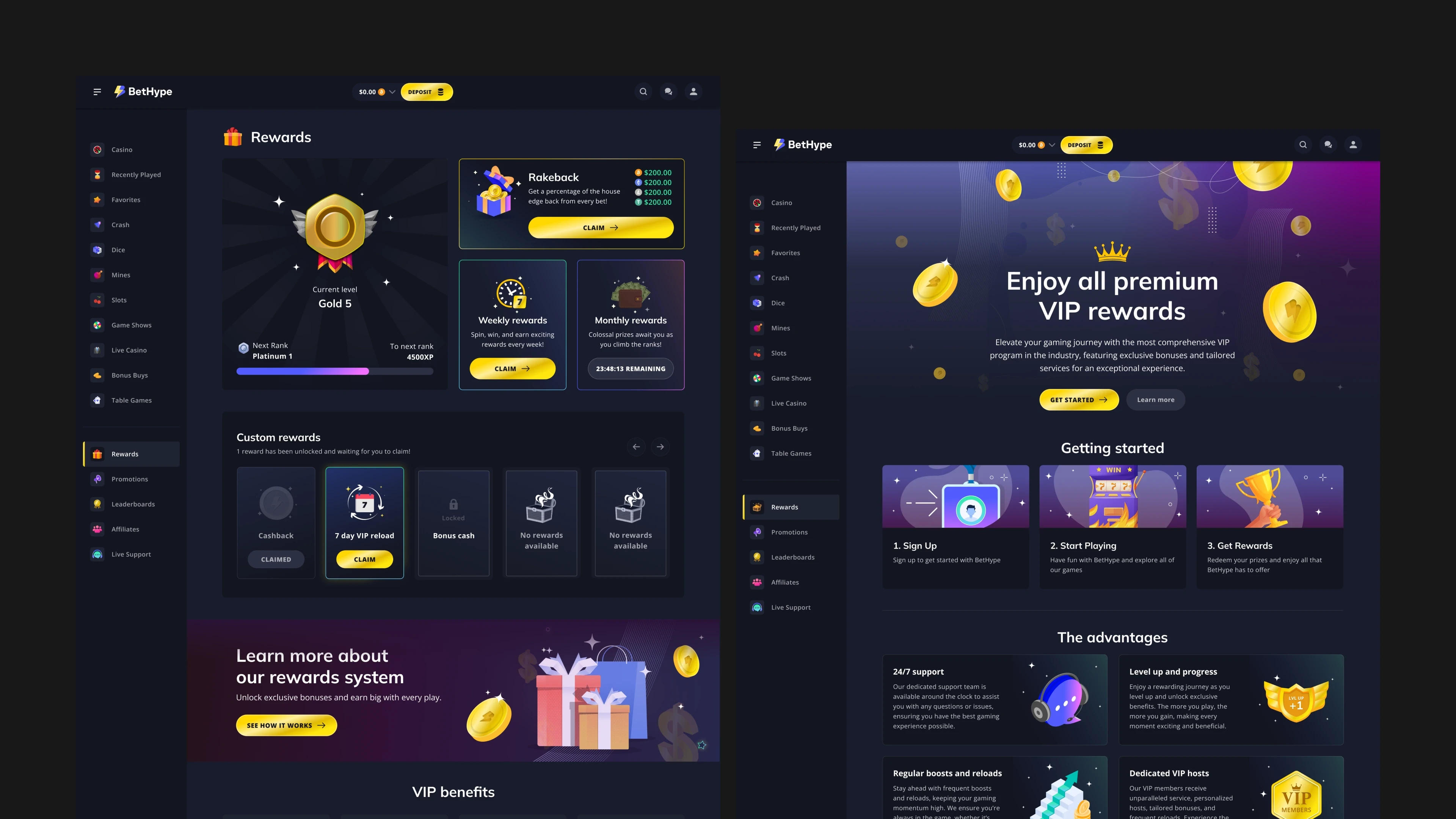
Rewards · the dashboard, and the VIP page behind it
04 — Outcome
Built, and live.
What began as a set of wireframes is a running crypto-casino. The brand was built out from an inherited logo, the platform designed from the ground up as one component system across the casino home, live games, and tables, and the whole thing handed over dev-ready to the team that built it. Live, and coherent from the first screen to the last.
Next Project