OR8
The challenge
Executive coaching is a category sold on perception. Most practices look indistinguishable: serif logo, stock-photo handshake, "transforming leaders" tagline. The serious operators stand out by not looking like the rest.
OR8 had no brand identity or digital presence. For a coaching practice targeting C-suite leaders, that's a credibility gap. Senior executives and their gatekeepers expect to see authority and professionalism before any conversation happens. Everything needed to be built from zero.
Approach
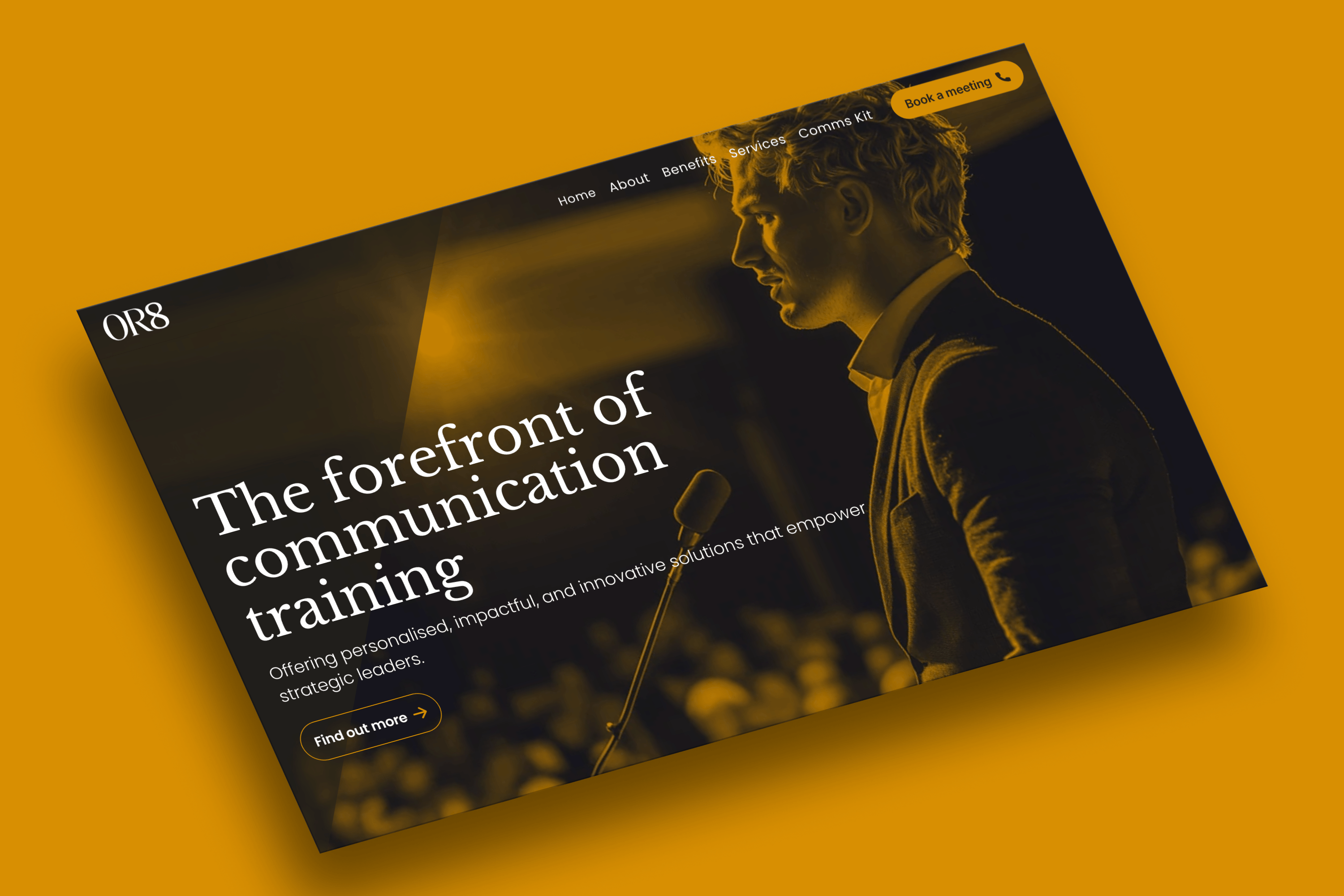
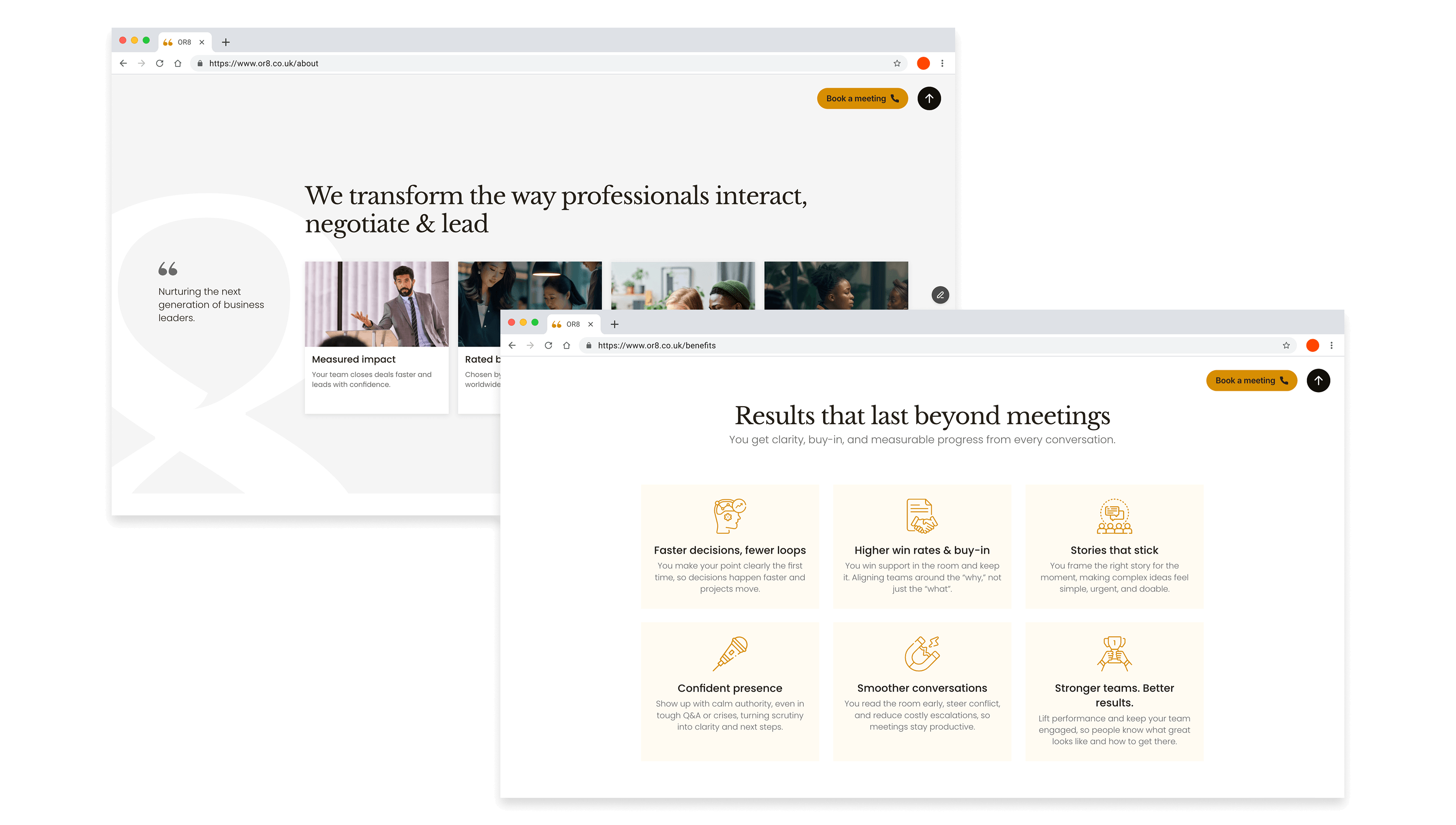
The design had to do the selling before any human interaction. For C-suite audiences, trust is established in seconds. Brand, tone, and interface were built to communicate authority without corporate stiffness.
Restraint over decoration, typography over imagery, white space over density. Senior audiences read calibre in what's left out as much as what's put in. Every visual decision was filtered through that lens.
What was delivered
A complete brand presence built from zero. Polished enough to open senior doors, restrained enough to read as the calibre of the work.
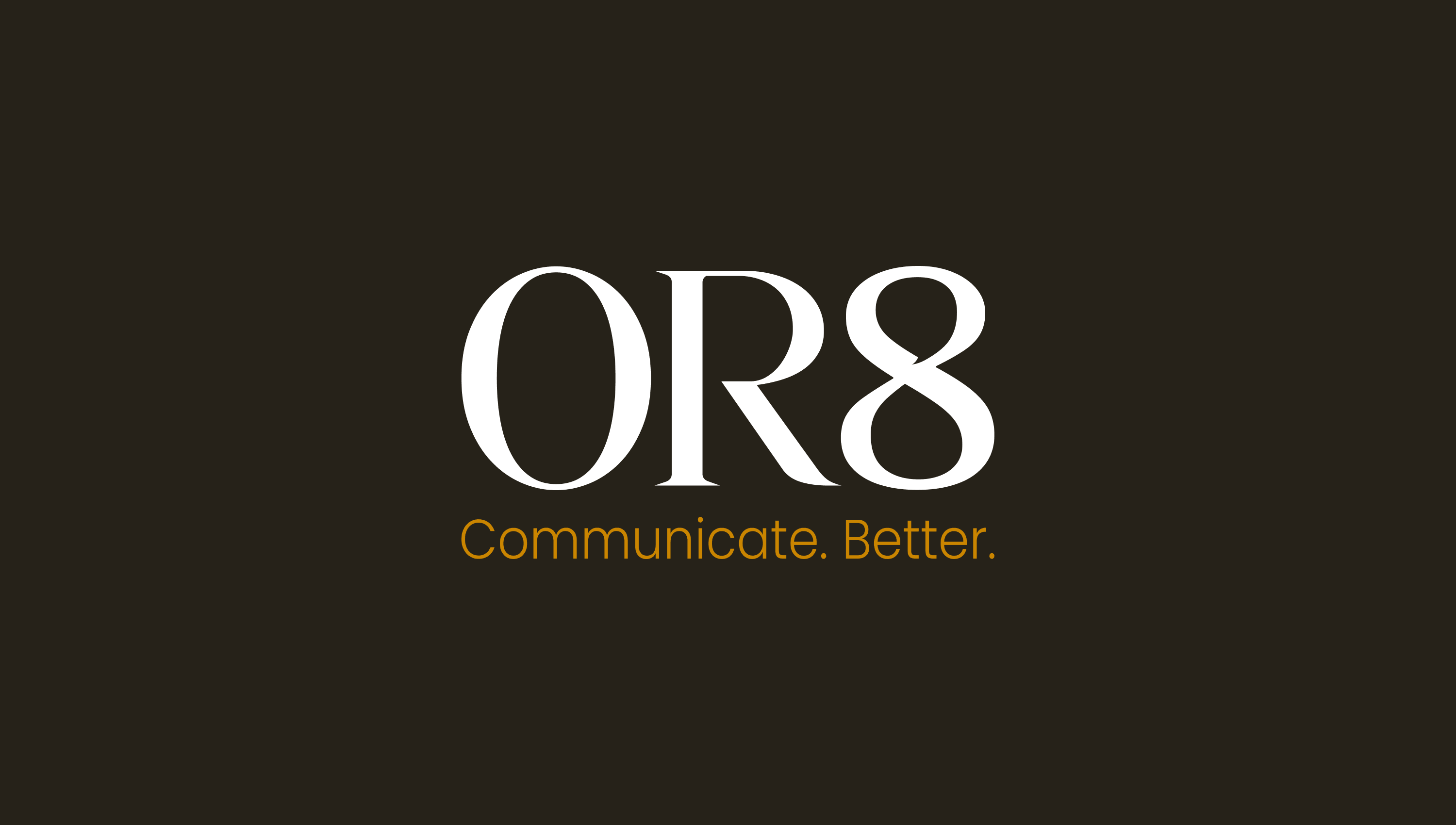
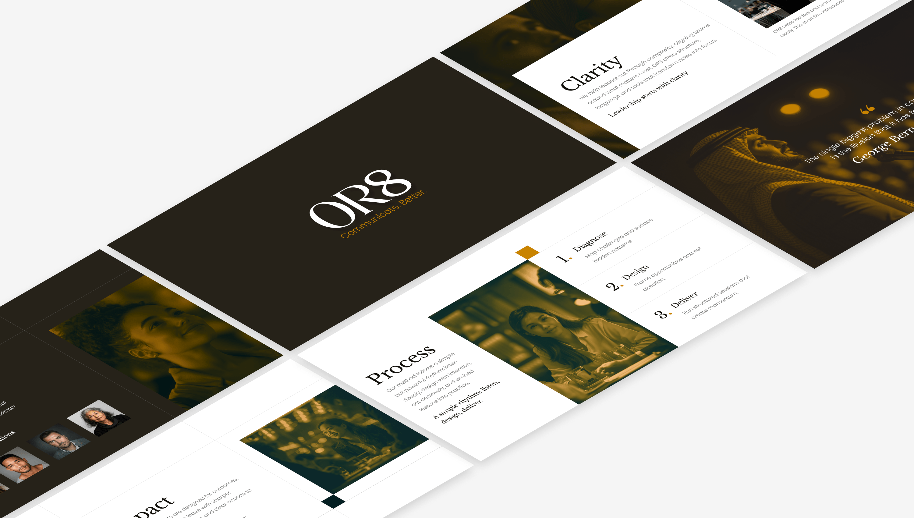
Brand identity
Visual identity designed for a premium, authoritative feel without corporate stiffness.
Website design
Full site in Framer structured to build trust and drive inquiries from senior audiences.
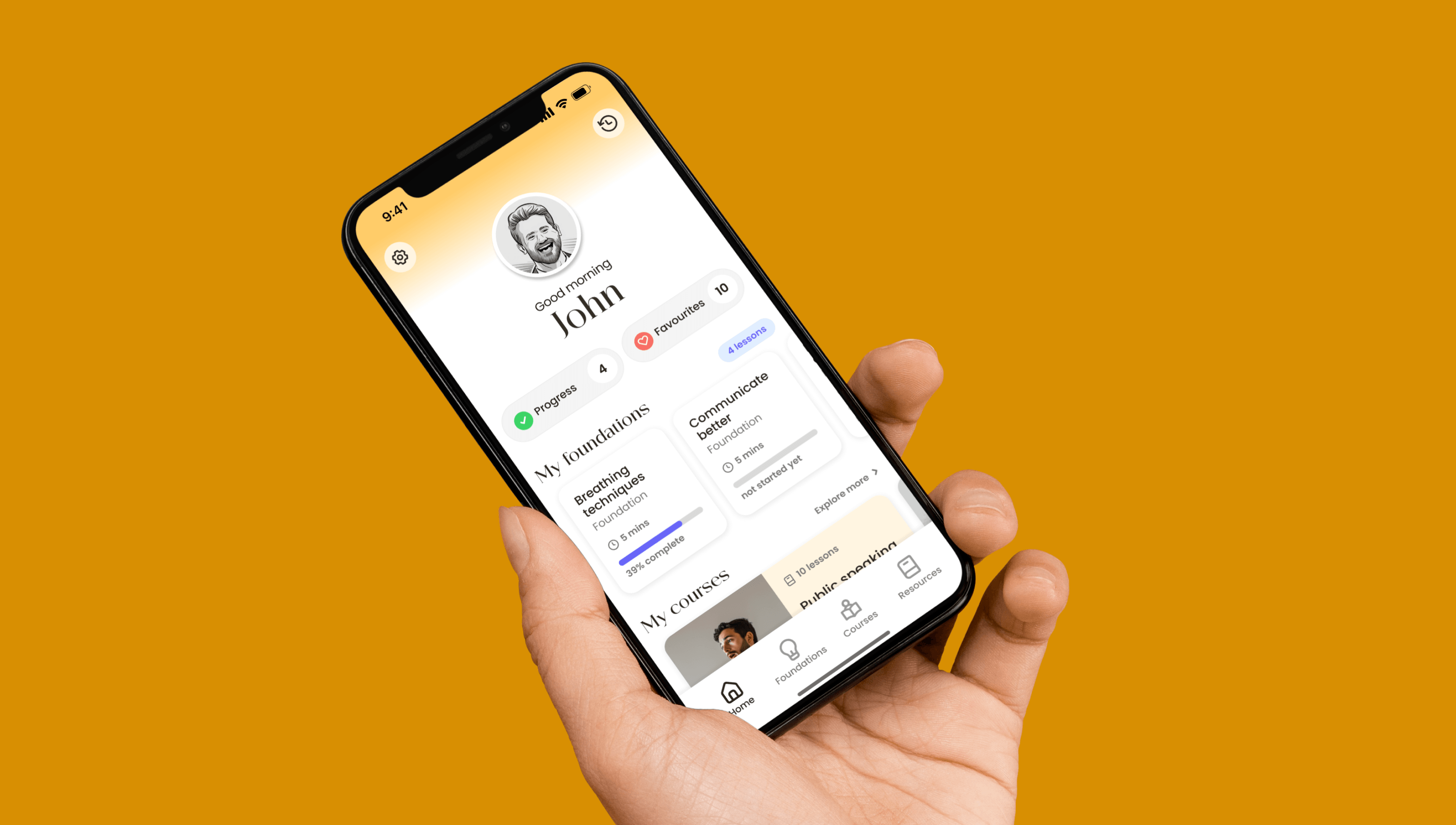
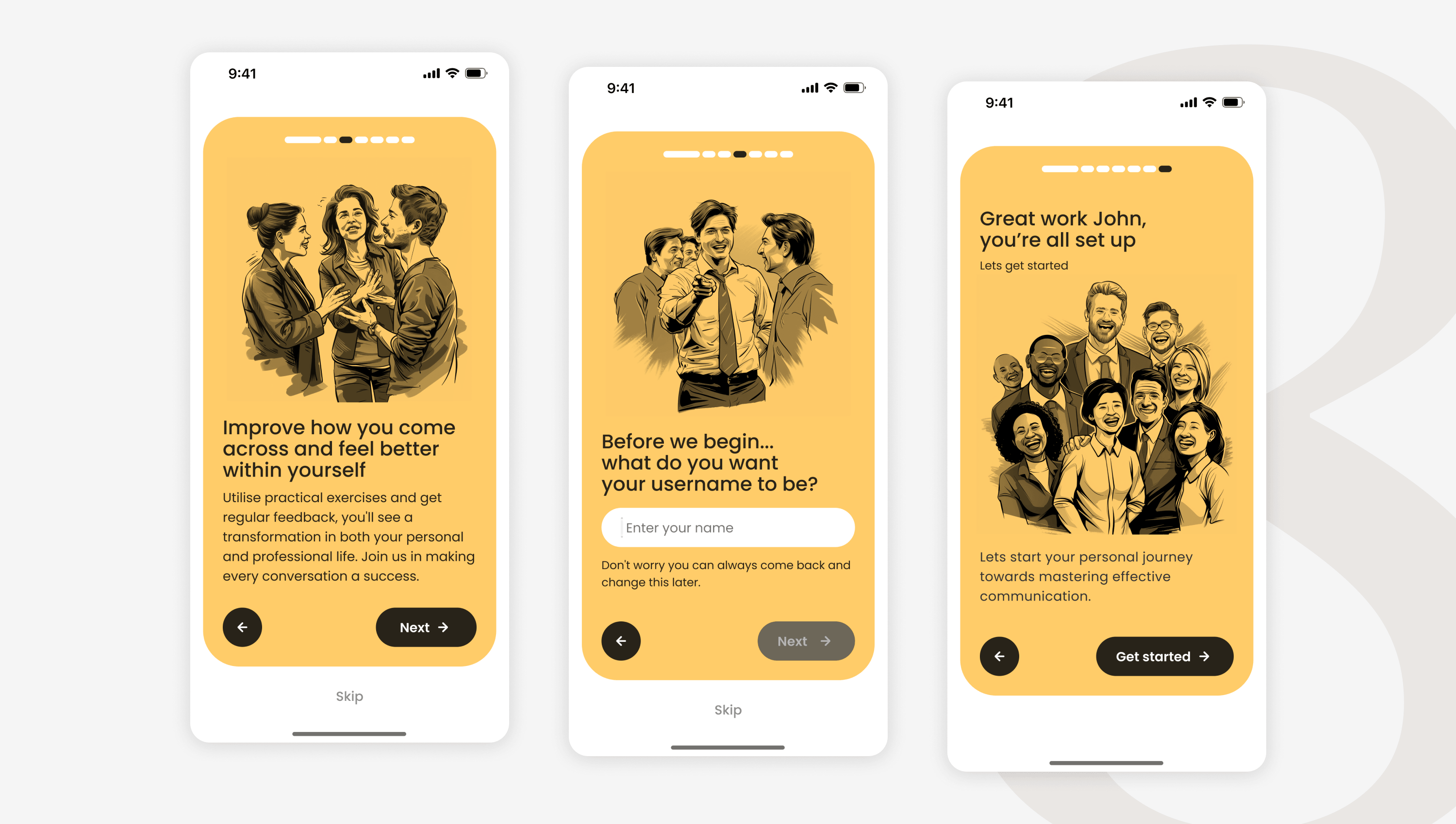
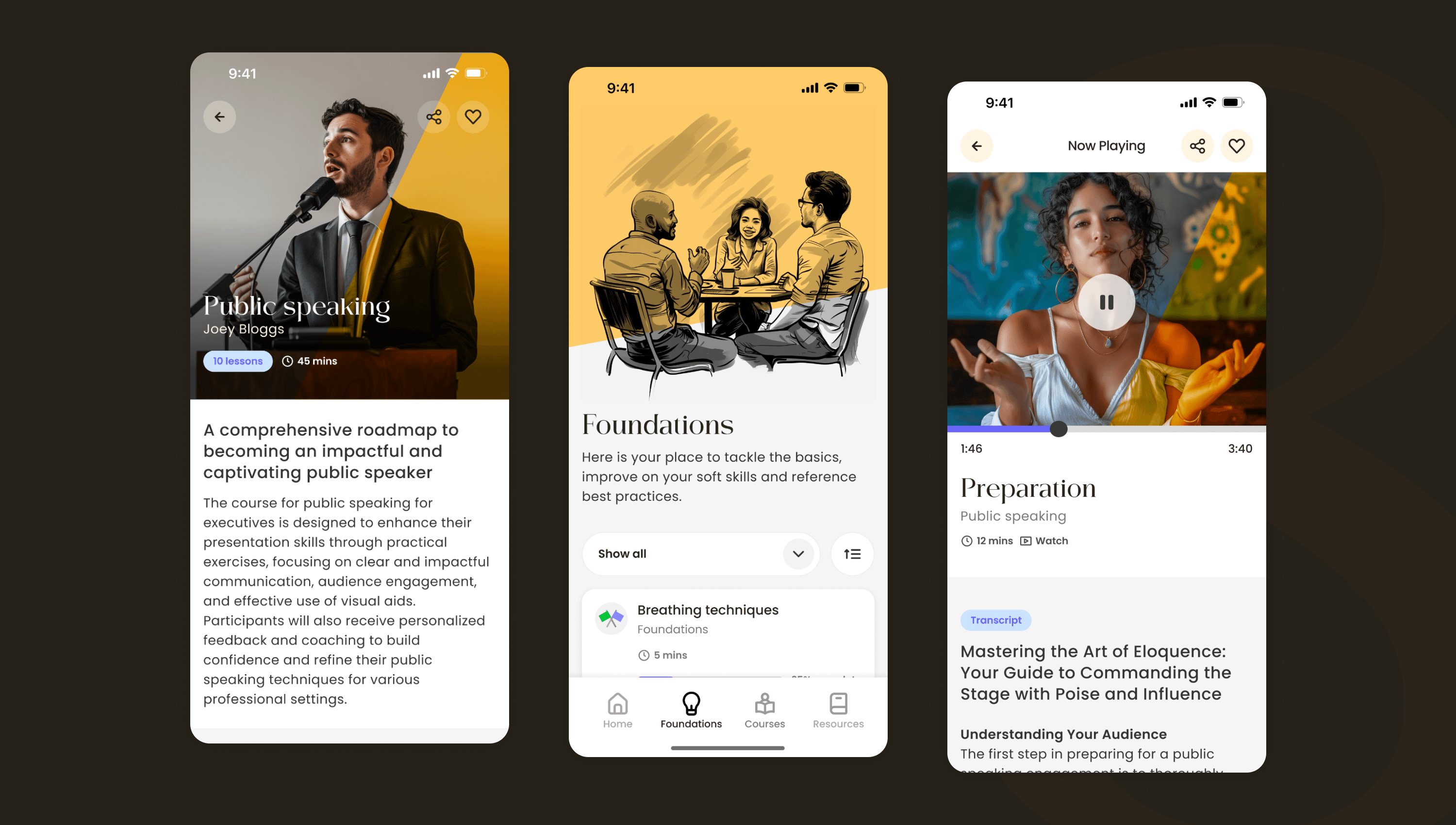
Mobile exploration
OR8 extended into a phone-first concept. Mapped how brand and audience would translate to mobile.
Visual system
Typography, colour, and imagery language designed to hold up across every touchpoint.
Outcome
The brand identity is in active use, carrying OR8 into rooms it couldn't enter before. Built from zero, calibrated to the calibre of who it had to address, restrained enough to read as authority rather than effort.